FORCE BRAINSTORM

3 ARTISTS THAT INSPIRE ME:
Tadao Cern
|


Guy Tal

He is a landscape photographer who focuses on natural landscapes and usually uses colours that match well together when capuring his pictures. The colours are always really vibrant and bright with catches people's eyes and draws them into his photographs.
|

This picture uses only blue and white colours as a theme, which creates a nice effect because the trees are all the same colour and the background is the same colour. It is a very bold picture because the colours are so contrasting to each other because of the differences in brightness.
|
Gordon Magnin

Gordon Magnin's work focuses on distorting parts of people symmetrically by using the same shapes to rearrange peoples features. This creates an image similar to a jigsaw puzzle as all the pieces are there, just in not the right areas. The use of background from Gorgon Magnin emphasises the subject of the picture and overall gives an enticing effect on the person looking at the image.
|
|

First Response - Forces of nature and the environment
Here, I walked around the school and looked for areas where nature has interacted and in some cases taken over the man made environment that it surrounds. I tried to keep in mind the balance between man made and nature and how sometimes our natural environment can easily overgrow and show strong signs of overtaking man made structures. The forces of nature overtake by adapting to its surroundings, and sometimes growing around or over it.
My top 4

|
I chose this picture to be in my top 5 because the bright green leaf contrasts well with the grey ground. The crack in the ground suggests the force of nature and how it struggled to make an appearance. Because the size of the stem and leaves are so small it suggest potential growth and nature overtaking man made things.
|

|
Because only parts of the foliage is shown in the window it suggests that behind the door there is much more greenery. Because one leaf is pressing against the glass of the window it gives the sense that it is trying to break free because it is so crowded on the inside.
|

|
I chose this picture because I like the way my camera focused and showed the closest bunch of stems so vividly. I gives a sense of how the nature has even gone over its boundaries in order to grow the way it wants.
|

|
Again, this is an example of nature doing what it wants in whatever place. I also like the use of focus in this picture like the one before.
Because the camera focuses on the web |
HOW I DID IT - on photoshop

|
I wento onto
Image > adjustments > sharpen I sharpened the amount up to 55% |

|
I then turned down the saturation which is under image too
|

|
Filter > photo filter > warming filter(81)
|

|
gradient editor > violet , green, orange
|

|
I then changed the levels to make it darker
|
|
BEFORE

|
AFTER

|


|
I increased the sharpness and vibrance of this picture as I thought the subject (the plant) needed to be more bold, stand out and contrast more with the concrete.
You can find the setting under: image > adjustments > unsharp mask and > vibrance |
|
BEFORE

|
AFTER

|
Second response - My local environment
I chose to take the pictures of my local area in the allotments behind my house. My theme when taking these pictures is to find places where it shows the true force of nature and its battle to reclaim its natural territory. I decided that this would be a good place to take my images as it is full of plants and greenery, and I hoped to find some abandoned areas which had been overgrown to express the true force of nature.

|
I chose this picture because the shadow of the sun onto the leaves gives a good effect of how overgrown it really is. The amount of greenery in this picture is really accentuated as it is the main shade/colour of the picture. I think this my best photo which represents the nature vs man made subject.
|

|
I decided that this is a good picture to portray man made vs nature. This is because the effect of the radiator being outside beside growing plants shows that it has been abandoned. This is also reinforced by the rust on the radiator which gives a sense of how old it might be with therefore also suggests that it is abandoned.
|
|
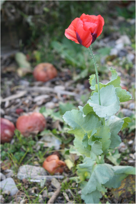
I really liked how the flower really is the focus of the picture and shows the natural side of it. The browns in the background give a great natural effect where all the different natural shades are included (greens, yelllows, browns ect)
|
Becauase the theme of forces is a dark subject and my picture of the poppy is one of the brightest, I decided to bring down the brightness in photoshop:
click on the pictures to enlarge them
click on the pictures to enlarge them

|
I brought down the saturation of the red as it is the brightest colour in the picture.
I went to image > adjustments > hue/saturation |

|
I then took down the green as it it is also one of the main brighter colours.
|

|
I then decided to take down the saturation of the whole picture to make it look more even.
|
AFTER

Landscape artist - James Griffioen
|
|
James Griffioen's work really captures how the nature has grown mindlessly all over a man made structure and how the plant has adapted to the structure's shape. These are also shown in the two pictures I took below which link into James Griffioen's photography because they interpret the same idea of man vs nature. However I think the picture on the right is much more similar to his work as it includes many more shades of green plants much like his, and the photo on the left has many more grey and brown tones because the nature included in the photograph is dead and is missing the same vibrance.
|

|
|
Applied Force
Obscured Force
|
BEFORE
|
AFTER
I duplicated the same image many time and increased the opacity so that the image wasn't as bold. I then played around with the sizes so many thing are going on within the frame.
|
How I did it - on Pixlr
I started off by going onto
adjustment } add image
adjustment } add image
I duplicated the image and then turned the opacity down.
I did the same as the frost two steps but reduced the opacity and size even more. I then moved it to a different location in the frame.
|
The finished product:
|
This time I increased the size of the picture and chose to use half the subject, which I thought made it more effective.
|
Environment continued
I chose to carry on with this strand because the forces of nature really inspired me to experiment how nature reacts to man made objects in its surroundings. I found that with my previous shoots, I had the most success as I was happy with the results of my pictures, and would love to explore this further. I will go out and explore more areas where nature has taken over man made structures in preferably abandoned areas. eugene richards nedev kander
FIRST RESPONSE - CAMDEN AND ISLINGTON CEMETRY
When taking these pictures I decided to experiment by taking the pictures from many different angles to see how to get the best outcome. I found that as it was getting darker my shutter speed started to slow down and consequently many of my images turned out blurry.
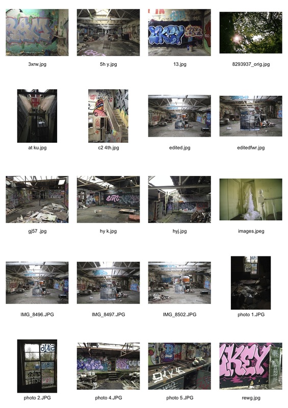
Second response - abandoned packaging factory
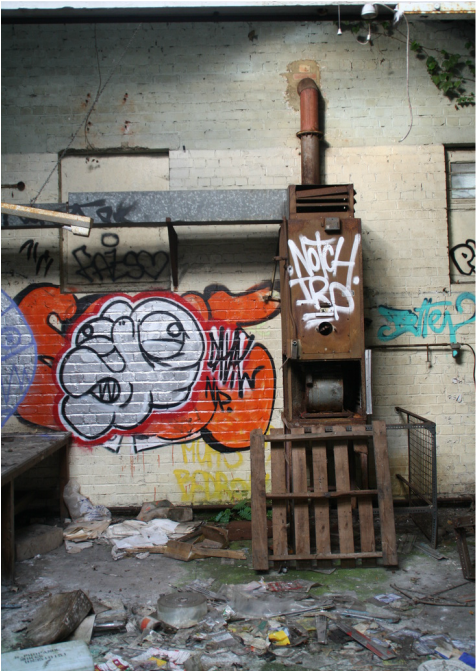
These pictures were taken at an abandoned packaging factory near Totteridge and Whestone station, which had been filled with junk and graffiti in the many years that it had been neglected. This helped me find so many interesting things to photograh. What surprised me was that many pieces of graffiti were highly skilled and eye catching which really brightened the place up.
Also, some facilities from the factory had been left in their places such as folders, catalogues, desks and chairs. However much of the little left was rusty or falling like the doors, ceiling and windows which had parts missing which made the pictures much more interesting. Because there is so much in the hospital, there are so many areas to explore with such small graffiti detailing where an artists had cleverly crafted objects into a smile or drawn a face on an empty plastic bottle, for example.
Also, some facilities from the factory had been left in their places such as folders, catalogues, desks and chairs. However much of the little left was rusty or falling like the doors, ceiling and windows which had parts missing which made the pictures much more interesting. Because there is so much in the hospital, there are so many areas to explore with such small graffiti detailing where an artists had cleverly crafted objects into a smile or drawn a face on an empty plastic bottle, for example.
Background -

|
On the left hand side of the picture, there is lots of bits to look and concentrate on when observing this picture, unlike the right hand side which is the most minimal aspect of the picture. What I like most about this picture is the bursts of colour in all areas, whether it be paint on the ground, big graffiti or different shades of plastic in the huge pile.
|
|
This picture is very minimal with a very simple subject. All the cutter is kept to the bottom of the picture, otherwise there isn't many other things condensed into a space. Also, the effect of the graffiti and the bright colours really contrast with the cream wall and brown metal as they are very dull and plain colours. Because of the graffiti, the photograph is an attraction to the eye and gives it an interest.
|

|
I selected this picture because I like that half of it is a focused close shot and the other is subjected to a longer distance away. Also, the big graffiti lettering catches your eye and gives the photograph some vibrance and colour. To me, it's if this picture is supposed to be two separate pictures because there is no clear transition from the left side to the right side.
|
|
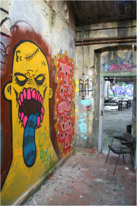
Like the picture above, this one has a closer focus and then a longer one (through the door) however it is not similar to the same extent because one part is much smaller than the other closer one. The big bright graffiti figure is the subject of this photo and is the only bright colour in the picture which bring extra attention to it. Also I like the use of colours in the graffiti are all quite similar (yellows, oranges and browns) apart from the blue tounge which slightly distorts the picture.
|
Interim Piece
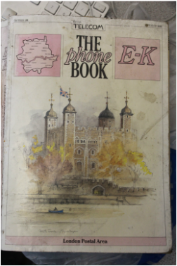
I decided to use the pictures from the initial shot in the abandoned hospital. When choosing my pictures I wanted to pick the most bold ones with the brightest colours because they were more likely to come out successfully. I printed the pictures onto pages from a phone book I picked up when I was taking pictures and then mounted them onto cardboard. I am really pleased with the outcome because I like how visible the pictures are, especially the top vertical one. I found that the pictures that came out the best were the ones with big and bright graffiti that took up a lot of the picture.

|

The book from 1987
|


Artist - Dez Santana
|
|
The work of Dez Santana links well into the pictures taken from the abandoned hospital as graffiti is the main focus of the picture. Similar to the hospital, these graffiti pieces are created in busy, urban areas and give a spash of colour to a dull colourless environment.
|
Artist - William Eckersy & Alexander Sheilds
|
|
This was shot over a 12 month period, by William Eckersy and Alexander Sheilds, taken from a project called 'Left London'. I really like how the artist has managed to capture the sheer abandonment of London and how long some places have been left for.
|
Artist - Francesca Hancox
|
|
These pictures are very similar to many of the images I took in my first response to 'Man vs Nature'. Hancox's work focuses on black and white close ups, with images that have a focus on a particular subject. Because most of her photographs are in black and white it gives a much more sombre and dark toned subject to her collection of pictures.
|
Continuation
I will continue my project by exploring more derelict environments where previous places had been used but are now in ruins. I would like to explore how the buildings have been eroding over the years e.g. peeling, dirt and broken furniture. I will base my research for new areas to photograph on a website called derelict london where you can find lots of derelict buildings under different categories such as; shops, hotels, restaurants, post offices ect.
Recycling Centre
As part of my continuation I went to visit abandoned buildings near Hornsey Recycling Centre where there were broken windows, piles of old materials and graffiti, which are all linked in with the aspect of dereliction for my project.
Artist - The Starn Brothers (Doug and Mike Starn)
|
|
The Starn twins use the method of blowing up and sectioning pictures into squares so it appears like a jigsaw puzzle. I like tis method because it allows you to lookin detail at each detail of the picture.
|


My response to The Starn Brothers

|
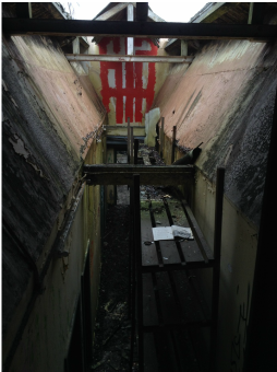
I interpreted the work of the Starn Brothers with this picture I took at the abandoned hospital to move my project forward. I cut it onto 12 pieces on photoshop which I would later stick together. I then printed each piece onto a page of the address book from 1987 that I picked up whilst picturing the building (shown above) and stuck each one down onto black card to it fitted together to make one big picture (below) of the photograph on the left.

|
I then took my big blown up picture back to the abandoned hospital and specifically to the big corridor pictured above. I placed it into the centre of the long corridor so it kind of gave a mirrored effect as I had taken a picture of the original place and placed it into the original frame so the picture included two photographs of the same place, one slightly smaller than the other.

I also tried to experiment with different distances from the printed image to see what different effects that it gives:
- you can click on them to enlarge them
- you can click on them to enlarge them
By doing this, I could see which distance I preferred


|


|
Whilst I was there I also took some more pictures of the hospital
How I edited the pictures:

|
Firstly, I selected the area I wanted to edit which in this case was my printed picture, so that it would stand out more and it would be noticed.
|

|
I then went onto:
Edit > adjustments > levels and adjusted the input levels to make the area more bold and clear. |

|
Similar to above I went onto:
edit > adjustments > brightness/contrast and made it slightly lighter or darker according to my liking, making sure that all the details were clear enough to see. |
OUTCOME

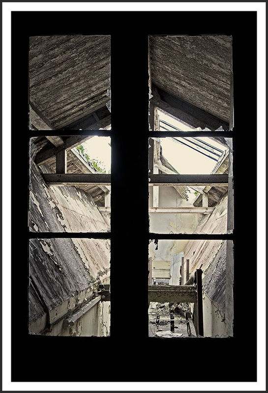
Due to the two slopes being on either side of the picture, they catch the light which exaggerates them and therefore gives the picture a 3 dimensional feel. A 3D feel is also shown by the sunlight also falling onto the walls and shelves and creating shady dark light but also some brighter light and also because the walls are old and peeling, they also create shadows and textures which stand out due to the light.
|

The reason I selected this picture I because I really love how much the graffiti stands out in this picture. What attracts me is all the different shades and patterns of blue within the letters. Some of the things that make it really stand out and attract the eye is the black and white outline, the plain black background that it stands on to bring the colour out and how it takes up half of the wall length.
I found this image of the same area I photographed on a blog-type website which I have linked. Here, I can tell that the artist has sharpened the picture and made it more vibrant. I prefer this one as it has a clear boarder and frame which really makes it stand out. |

|
I edited this one this way because I really wanted to make the print out stand out more because I feel it is not as clear as i'd prefer it to because of its size in comparison to its surroundings. By taking the colour out of its surroundings the main eye catching part is the print out so it forces you to pay attention to the detail and what the picture on the card actually is.
|
Artist - Noemie Goudal

|
The work of Noemie Goudal links in with my own because she interprets the technique of splitting up one big picture into many sections, just like mine. She combines an external shot and creates an opening to lead the viewer throughout towards her ideal outside environment. Her choice of backdrop is seen to be very 2D ,which frames and provides the setting for the juxtaposition of images as her choice of picture placed in front contrasts this and looks very 3D.
|
